
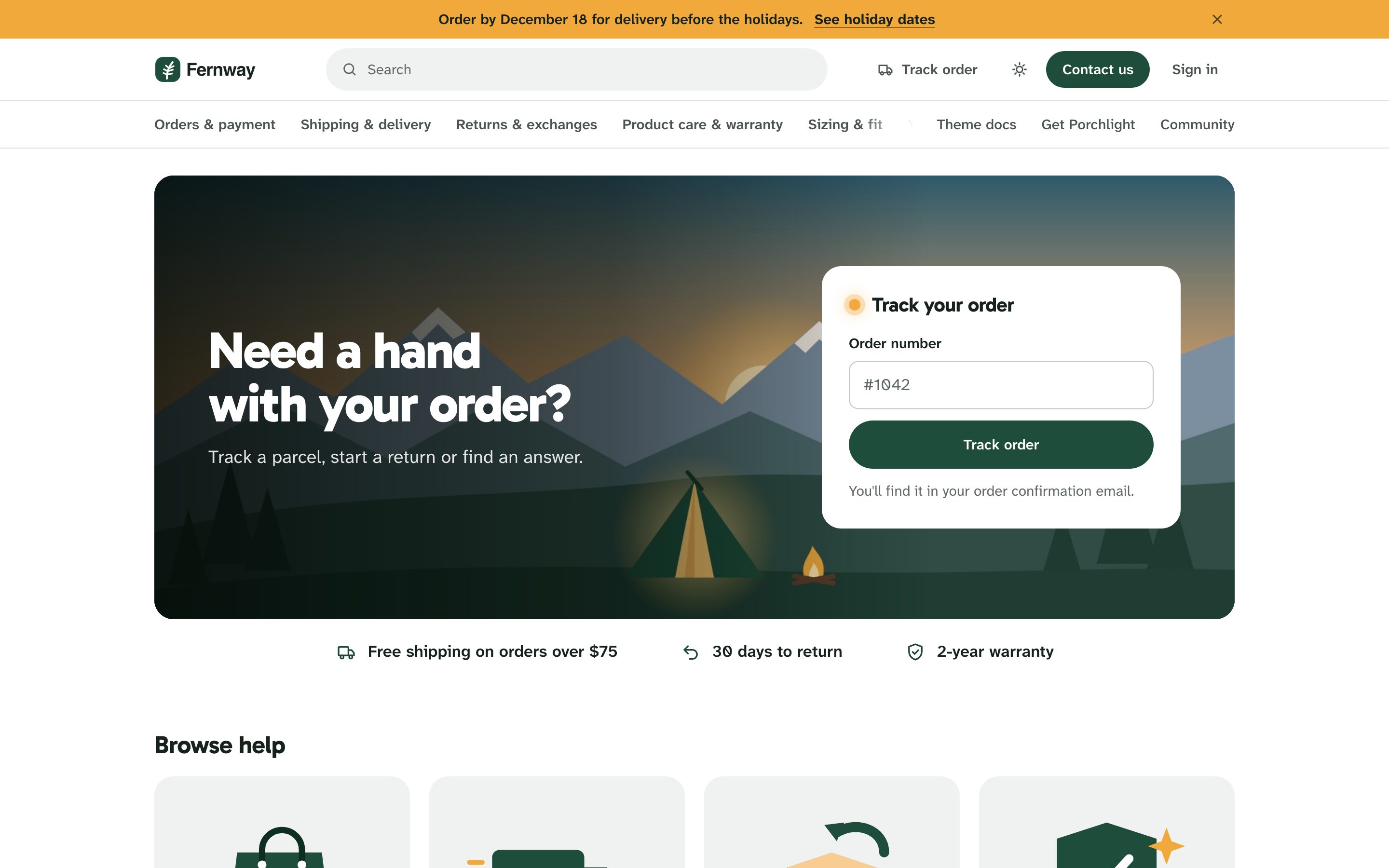
The home page is laid out like a store: a search in the header, a bar of topics like store departments, a big picture, then the help itself.
The picture and Track your order
The picture is ImagesHome hero image. Porchlight ships with a drawn porch at dusk; replace it with a photo of your products or your store. A shade of your brand color sits under the headline so the words stay readable on any photo. On phones the picture runs edge to edge and the card sits just under it.
On the picture: your Headline and Subtitle, and the Track your order card, where shoppers type their order number. What the card does depends on your Order tracking settings: it opens your tracking page, or your order problem form with the number filled in. See Order tracking.
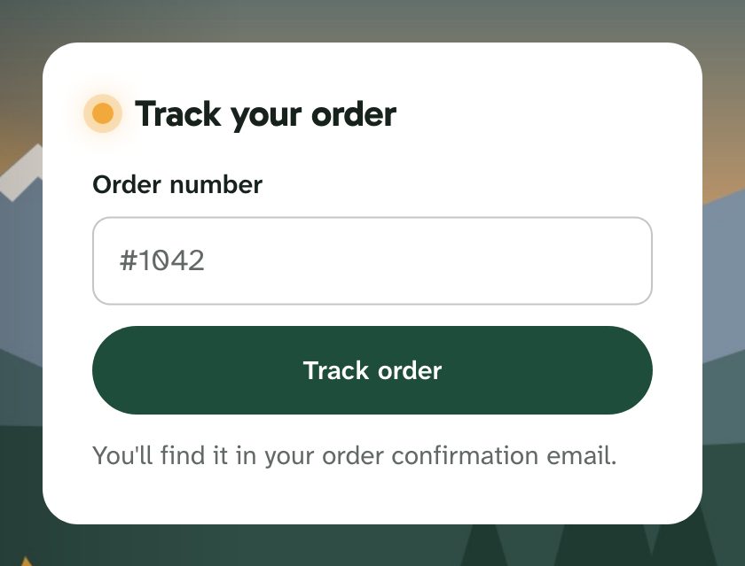
Turn the card off with Home pageTrack your order card. The headline then sits alone on the picture, and the Track order links in the header and after articles disappear too.
Store promises
Up to three short lines under the picture: Store promise 1, 2 and 3, such as Free shipping on orders over $75, 30 days to return, 2-year warranty. Each gets an icon picked from its words (shipping gets a truck, returns an arrow, warranty a shield). Leave one empty to hide it.
Topics
Zendesk categories are called topics on the page. Browse help shows each one as a card with a drawing, its name and the start of its description: two columns on phones, up to four on wide screens. From the ninth topic on, the rest are listed by name only, so a large help center stays short.
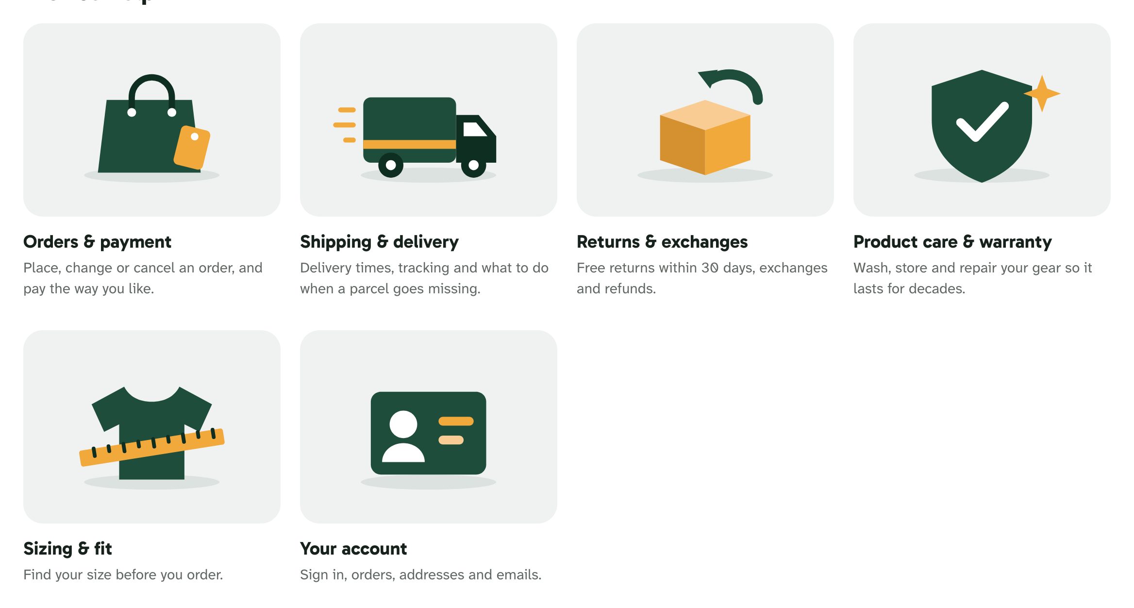
Each drawing is picked from the topic's name: Shipping gets a delivery truck, Returns a parcel with an arrow, Sizing a shirt and a tape measure, Gift cards a gift, and so on. Porchlight recognizes common store words in English, French, German, Spanish, Portuguese, Italian, Dutch, Japanese and Korean. A name with no match gets one of the store drawings, the same one every time. The drawings use your brand and highlight colors, so they follow your colors and dark mode.
To use your own photo, or another drawing, set Home pageTopic pictures and icons with topic:picture pairs separated by commas. topic is the topic's name or id; picture is the URL of an image or the name of a drawing:
Shipping:https://example.com/parcel.jpg, Care and repairs:leaf, 360001234567:gift
Drawing names: truck, return, cart, card, box, ruler, leaf, gift, tag, shield, user, store, alert, globe, chat, lock, book. Photos are cropped to the card's shape, so a square or landscape picture works best. The same pairs set the small icons used in menus and on request type cards, where the names wrench, folder, mobile and spark also work. In a translated help center, pictures follow each topic's name in its original language, so they stay the same in every language.
Topics bar
HeaderTopics bar lists every topic under the header, like a store's departments, with the current topic underlined. On phones it scrolls sideways and fades at the edge to show there is more. Your header links and the community, when you have one, sit at the other end of the bar.
Common requests and popular searches
Common requests are four buttons for what shoppers come to do. Each has a label and a link under Home pageRequest 1–4:
| Button | Default label | Icon | With no link |
|---|---|---|---|
| Request 1 | Start a return | Return arrow | Opens the request form |
| Request 2 | Exchange a size | Ruler | Opens the request form |
| Request 3 | Change or cancel an order | Pencil | Opens the request form |
| Request 4 | Report a problem with an order | Warning sign | Opens the Order request form set under Order tracking, or the request form |
A link can be a full URL (your returns portal in Loop or Shopify, for example) or a help center path such as /hc/en-us/articles/123. Clear a label to hide its button, or turn them all off with Common requests.
Popular searches shows up to eight one-click searches under the buttons, written comma-separated: Where is my order, Sizing, Gift cards, Warranty.

Top questions and Still need help?
- Top questions lists your promoted articles. Promote an article in the Zendesk editor to add it.
- Recent activity (off by default) adds Zendesk's list of recently updated articles and posts.
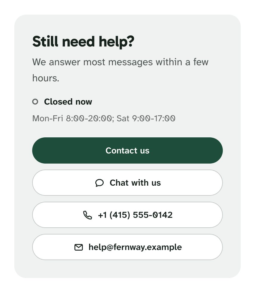
- ContactContact block is the Still need help? block next to the top questions, with Contact title and Contact text. It holds a Contact us button and, when you set them, Chat option (opens your Zendesk messaging or Web Widget), Phone and Support email.
Support hours
Write ContactSupport hours the way you'd say them, and set Time zone to your team's time zone (America/New_York, Europe/Paris, Australia/Sydney). The hours show as you wrote them, with a dot and Open now or Closed now, worked out in your time zone. Without a time zone, Porchlight uses the visitor's own clock.
Porchlight understands:
- day names in English, shortened or not:
Mon-Fri 9:00-18:00,Sat 10:00-14:00,Mon, Wed, Fri 9-17; Daily,WeekdaysandWeekends:Daily 8am-8pm;- several rules separated by semicolons:
Mon-Fri 9:00-18:00; Sat 10:00-14:00; - hours past midnight:
Fri 18:00-02:00; 24/7.
If Porchlight can't read the hours, it shows them without the dot. Holidays aren't known to it; use the announcement bar for those.
Promotion banner
A banner after the contact block, for a sale, a gift guide or a new collection: Promotion bannerShow the banner, with a Banner title, Banner text, Banner button label and Banner link. Banner style is a soft tint of your brand color, the solid brand color, or dark. Without a link the banner stays hidden.

Header

- Announcement bar: one line above the header in your highlight color, for shipping cut-offs, delays or a sale, with an optional link (Announcement link label and Announcement link). Visitors can close it; a new message shows again.
- Your logo and, with Show Help Center name, the help center's name.
- Search in the header: a search field in the middle of the header on every page. Clicking it opens quick search, with results as the shopper types. Visitors can also press / or Ctrl K anywhere. Turn that off with Search settingsQuick search.
- Track order in the header: a link to the Track your order card. On the home page it jumps to the order number field; on other pages it opens the home page there. It only shows while the card is on.
- Ask AI, when Zendesk's AI agent is on for your help center, the light/dark switch, Contact us and Sign in.
- Header link 1 and 2, such as Back to the store, sit at the end of the topics bar.
- On phones and small tablets, the header keeps your logo, a search icon, the light/dark switch and a menu button. Topics, header links, Contact us and account pages move into the menu; the Track your order card is on the home page, and the Contact us button at the bottom of the screen follows the shopper.
Contact us on phones
ContactContact button on phones adds a Contact us button at the bottom of the screen once a shopper scrolls down. It steps aside while the contact block or the footer is on screen, doesn't appear on the request pages, and stays hidden when your Zendesk messaging button is on the page, since that does the same job.
Footer
Your logo, Footer text, social links (X, LinkedIn, YouTube, GitHub, Facebook, Instagram), three link columns and a Support column with Contact us, My requests (for signed-in visitors) and the community. Write each column's links as Label|URL pairs separated by commas:
Jackets|https://shop.example.com/jackets, Packs|https://shop.example.com/packs, Gift cards|https://shop.example.com/gift-cards
Columns without links are hidden. The language picker sits at the bottom when your help center has more than one language.
Error pages
The not-found page has a drawing, a search field, and buttons back to the home page, to Track order and to Contact us, so a shopper who followed an old link still gets somewhere.